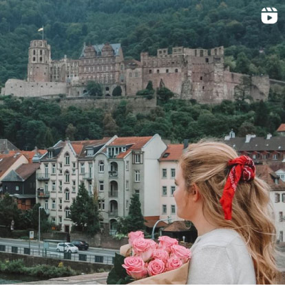
Blogging requires you to not only write, but to also be a part time graphic designer. You don't have to know everything, but it's important to figure out how to size images and make them look pretty. You need to be able to make a button for your blog, or add text to images, or edit grainy photos.
There isn't a day that goes by that I don't use PicMonkey for my blog. It's by far my favorite blogging tool. There are some excellent tools that you can use that you might not be aware of. I'm not a designer, but I consider it to be an easier (and cheaper) version of Photoshop. I use PicMonkey Royale (it's only $4.99 a month or $33 for a year) and has been so worth it.
I thought I'd show you some of my tricks and tips I've learned along the way.
Here's how I use PicMonkey for my blog:
PicMonkey Effects
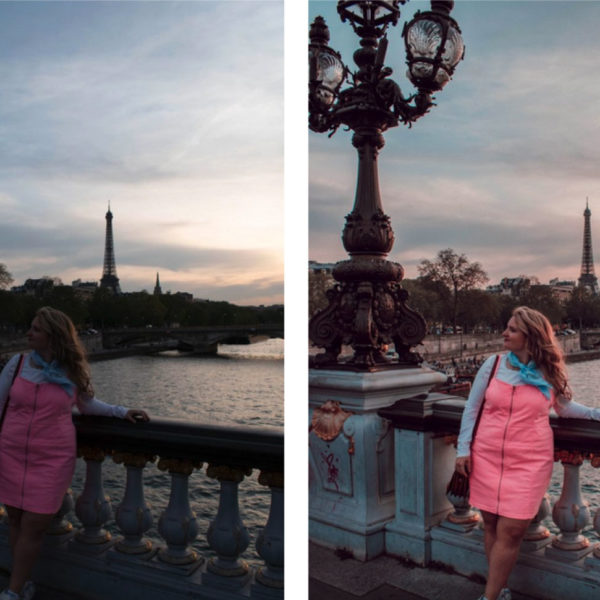
To upload an image, simply click edit, and you can upload from your computer. Or click design to start with a blank slate. I like playing around in the “Effects” section first. My favorite effects to add to my images are to slightly up the “Boost” feature (to maybe 10-20%) and then “Tranquil” to mellow out the image.
If a photo is too dark, I like using the “Curves” feature in effects to brighten the image. You can also use this to invert the color in the photograph.
Sometimes I use the “Clone” feature, if there's a scratch or dust on the picture you can buff it out. Select the source and click where you want to duplicate it. Of course, you can make images black and white and play around with all of the effects, but those are my favorites.
Using Text in PicMonkey
You can add text to your images or you can click design to add text to a blank canvas. On the left hand side choose the “text” option. You can choose from PicMonkey's fonts OR you can use your own. I love this feature because that way not all of my fonts are the same as everyone else that uses the service.
You can add more fonts, dafont.com is Sarah's recommendation and I agree. Just download the fonts and clear your cache cookies and the fonts will appear.
Overlays
When I'm making my own images, I like adding overlays. You can pick from their options of overlays or add your own. I also like using the fade feature so the text pops or the image is more prominent.
If you right click, you can choose to send the overlay to back (behind the text or behind another overlay) or in front.
PicMonkey Textures
I also use textures to give images effects, make them look vintage and many other characteristics. You can make it look like you wrote on paper. Here I used the smudge effect and bumped up the saturation and increased the fade effect.
They even have a holiday “theme” section full of fonts, overlays, and effects to use during the season.
Those are some of my favorite features that I use almost everyday. What are some of your favorite features or tutorials? I think there's always something to learn!
P.S. today only, take 25% off using code “NOV” for all Large and Medium ad spots! I rarely offer sales, so get it while it lasts! Offer ends at midnight tonight! Check out all sponsor options here.

